DBT performance monitoring on Snowflake
Snowflake has introduced a new GUI called Snowsight. This includes a nicer interface and primitive dashboarding functionality.
In this blog I'll walk through how I used it to analyse our overall db run time. We start by optimizing our warehouse usage, then look at longest running queries, and finally visualize the timing of the complete run in a Gantt chart.
Step 1: Configure your warehouse
Warehouses in snowflake are your buckets of compute. They configure how much resources you are willing to throw at a particular problem. I assume you have already split up your database into dev/test/prod environments and have made sure that you configured a warehouse for each. Doing so will allow you to know that if the test run takes x hours to complete, your prod run will also take x hours to complete. Disable automatic scaling because that will make it hard to dial in the right amount of threads on the dbt side.
Step 2: Start collecting metrics on your warehouse
You can now start collecting metrics on your warehouse. The QUERY_HISTORY_BY_WAREHOUSE call is pretty slow, so we use dbt to collect information after each run. Create a dbt incremental model called query_history.sql like so:
{{ config(materialized='incremental', unique_key='query_id') }}
SELECT
*
FROM table(information_schema.QUERY_HISTORY_BY_WAREHOUSE(result_limit => 5000))
WHERE execution_status = 'SUCCESS'
AND database_name = CURRENT_DATABASE()
AND user_name = CURRENT_USER()
Now at the end of your dbt run, collect the history by running dbt run --models models/query_history.sql. You can also run this during, but then you will probably be a run behind on your data every time.
Step 3: Align dbt threading to your warehouse
If you try to run more queries then your warehouse can handle, Snowflake will automatically queue the query to wait for resources to be available. dbt meanwhile will not see this, it just thinks it has executing a query and is simply waiting for the results.
Let's just start with a given warehouse size and configure our dbt threading correctly. Start with a large threading number (like 10), run your dbt project and simply open up the Compute ... Warehouses page in Snowsight and see follow along with the number of queued queries.
As soon as a queries gets in the queue, stop your dbt run and lower the threading number. You will end up with your maximum queue-less threading count, which is probably around 5 for a small warehouse, but depends also on your project size and scaling configuration.
Now that we have configured the dbt threading to match our warehouse size (remember, these are the compute limits), we should start monitoring it.
Luckily we have a some QUEUED_..._TIME columns in our query_history model we can use to see how much we are queueing. This is the first chart we want to create in our Snowsight query performance dashboard. The queue time we see in the warehouses:
test as (select
    date(end_time) as execution_date,
    warehouse_name,
    SUM(QUEUED_PROVISIONING_TIME + QUEUED_REPAIR_TIME + QUEUED_OVERLOAD_TIME) as queued_time
from TEST.ANALYTICS_INTERNAL.QUERY_HISTORY
group by execution_date, warehouse_name
),

prod as (select
    date(end_time) as execution_date,
    warehouse_name,
    SUM(QUEUED_PROVISIONING_TIME + QUEUED_REPAIR_TIME + QUEUED_OVERLOAD_TIME) as queued_time
from PROD.ANALYTICS_INTERNAL.QUERY_HISTORY
group by execution_date, warehouse_name
)

(select * from test)
union (select * from prod)
order by execution_date asc
This will monitor our daily queue time warehouse. If we see a lot of queueing we can either scale the warehouse up or bring the dbt threading down. A Snowsight graph is easily created
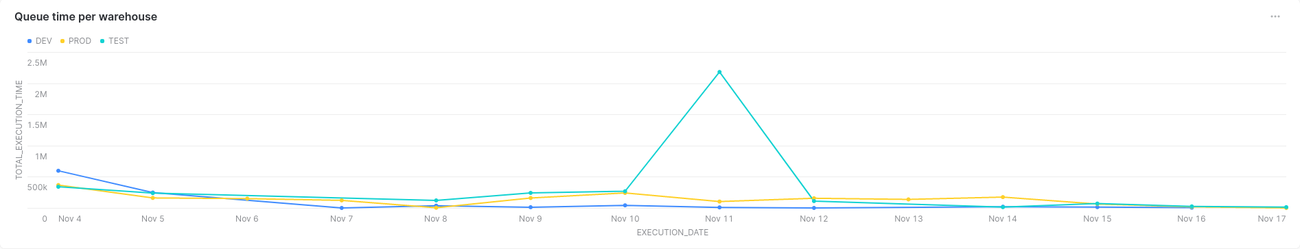
Of course monitoring this by hand is a fools job. After looking at the graph for a few days we pick a queue time we are comfortable with, we could write up a dbt test to ensure that for the last few days we have not exceeded our queue limit for our test and prod environments. However, you could (and probably should) use actual monitoring tools for monitoring, so I leave that part outside of the scope of this blog post.
Step 4: Finding the slow queries
We now have a multi-threaded execution of a dependency tree of models. This means that you can best optimize by maximizing thread utilization. Because of this, making your slowest query 10 minutes faster might not make your full run take 10 minutes less.
Let's ignore that complexity and just focus on the slowest queries first. From the queries we take the 'CREATE_AS_SELECT' queries and use a regex to filter out something that is probably the table name:
select
    REGEXP_SUBSTR(query_text, 'table [^.]+.([^ ]+)', 1, 1, 'e', 1) as query_table,
    round(avg(execution_time) / 1000 / 60, 2) as avg_execution_minutes,
    max(date(start_time)) as last_run_date
from DEV.ANALYTICS_INTERNAL.QUERY_HISTORY
where
EXECUTION_STATUS = 'SUCCESS'
and query_type = 'CREATE_TABLE_AS_SELECT'
and date(start_time) > DATEADD(day, -2, CURRENT_DATE())
group by query_table
order by avg_execution_minutes desc
Resulting in

Speeding up the slowest query might not speed up the whole run the most.
Step 5: Display the run in a Gantt chart
If we ceate a A Gantt chart, we should be able to see which queries are chocking the run and which query is probably best to optimize.
To create a Gantt chart we:
- Select a time window containing our run (
between) - Give all queries a unique number (
row_number() over query_table) - Plot a line if the query is running from start to end point (
unionstart times and end times)
Combining those in a query we get
with query_times as (
select
    REGEXP_SUBSTR(query_text, 'table [^.]+.([^ ]+)', 1, 1, 'e', 1) as query_table,
    CONVERT_TIMEZONE('UTC', max(start_time)) as start_time,
    CONVERT_TIMEZONE('UTC', max(end_time)) as end_time
from test.analytics_internal.query_history
where
execution_status = 'SUCCESS'
and query_type = 'CREATE_TABLE_AS_SELECT'
and CONVERT_TIMEZONE('UTC', start_time)
    between TIMESTAMP_TZ_FROM_PARTS(YEAR(SYSDATE()), MONTH(SYSDATE()), DAY(SYSDATE()), 6, 0, 0, 0, 'UTC')
    and TIMESTAMP_TZ_FROM_PARTS(YEAR(SYSDATE()), MONTH(SYSDATE()), DAY(SYSDATE()), 8, 0, 0, 0, 'UTC')
group by query_table
order by start_time desc
limit 600
)

(select query_table, start_time as time, row_number() over (order by query_table) as active from query_times)
union (select query_table, end_time as time, row_number() over (order by query_table) as active from query_times)
order by time, active
The charting in Snowsight will automatically combine a dimension if it's above a certain limit, so it felt right to also add a limit 600 to the query so we know for sure we do not get an other category.
The chart will show you a line for each query being executed.
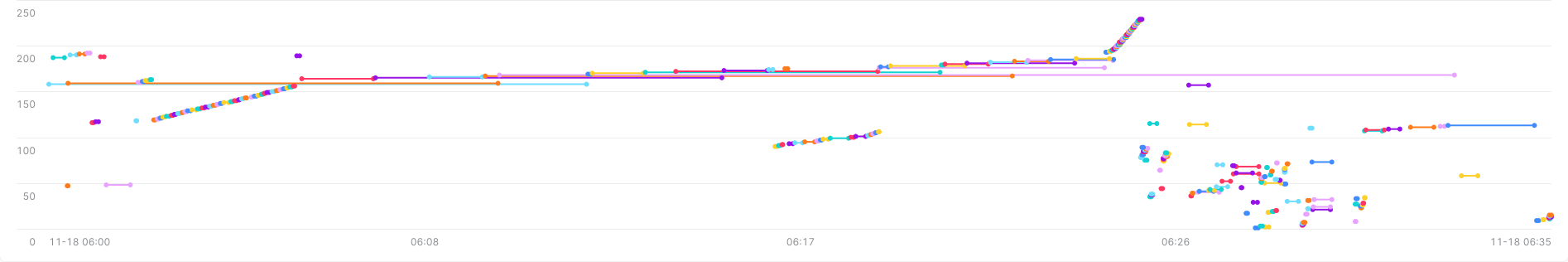
This clearly shows fast, small queries and longer running dependencies of those small queries. Also it looks like a lot of small queries are dependent, but this is probably because the thread pool is full and these queries have to go in sequence.
Step 6: Make it beautiful
In the whole make it work, make it beautiful, make it fast we have covered the make it work only. There are particularly ugly parts in there that I leave to the reader to clean up if they feel like it. For example, the BETWEEN with the timezone changes are ugly. That could probably do with a ::timestamp_ntz to simplify the time setting on the other side.
Happy hacking!